

SBC & Dilution Tracker Dashboard Launch
Quarterly dilution analytics, a live leaderboard, and source-auditable methodology across 80+ public companies, all in one place.

I’ve been writing about stock-based compensation and dilution for a few years now. The first post was a back-of-envelope exercise on rideshare companies. Then it turned into a ground-truth methodology post. Then a leaderboard. Then quarterly updates. At some point I had to admit the recurring post format wasn’t going to cut it anymore, and the data needed a permanent home.
Platform Aeronaut Dilution
Today I’m launching Platform Aeronaut Dilution, a live, queryable platform for public-company SBC and dilution analytics. It covers 80+ companies across Big Tech, Internet, Software, and Non-Tech, updated quarterly as earnings roll in. Think of it as the dilution analysis I’ve been publishing, except interactive, permanent, and filterable.
Below I’ll walk through what the site does, why the methodology is built the way it is, and a few of the current data points that I find most interesting.
Why Dilution Deserves Its Own Platform
The one thing I keep coming back to is that dilution is the most persistently underweighted factor in how investors evaluate technology companies. It’s not that people don’t know about SBC (it comes up in every earnings call and every analyst model). The issue is that it gets waved away. “Non-cash.” “It’s already in the diluted share count.” “Everybody does it.”
None of those are actually good answers. When a company runs at 4% dilution per year, the market cap of that business needs to compound 22% over 5 years just to keep the stock price flat. That math is real regardless of how the expense is classified on the income statement.
What I kept finding as I dug deeper into the data was that it’s genuinely hard to do this analysis across companies at scale. Every management team has their preferred framing. Some use forward dilution, some trailing, some SBC-as-a-percent-of-revenue. The numbers are scattered across 10-Ks, proxy statements, and earnings supplements. There’s no single source of truth.
The platform is my attempt to build that source of truth: a consistent, cross-company lens on dilution that doesn’t follow each management team’s preferred presentation.
What’s On the Site
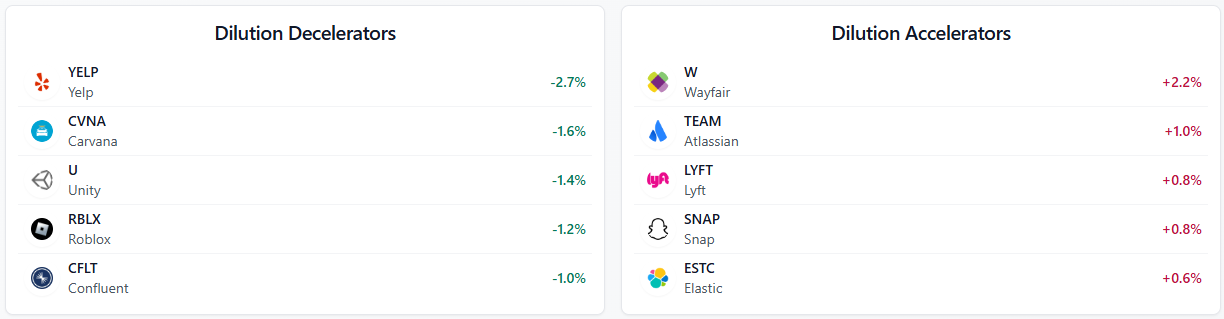
The homepage gives you a quick snapshot of the current state of the market: a run-rate dilution aggregate across covered public companies, SBC as a percent of FCF, and the leaderboard movers for the current quarter. The dilution decelerators and accelerators widget is one of my favorite features: it’s the fastest way to see who’s improving and who’s getting worse quickly.
From the current data: YELP is the top dilution decelerator meaning their forward dilution today is better than their blended dilution implying future deceleration to their dilution rate. On the dilution accelerators side, Wayfair increased 2.2 points and continues to be one of the more egregious diluters in the coverage universe. Lyft, Snap, and Atlassian are also on the wrong end of the movers list. None of those should surprise anyone who’s read the prior posts.
Dilution Leaderboard
The Leaderboard page is where the full ranking lives. Right now the top of the tech leaderboard looks like this:
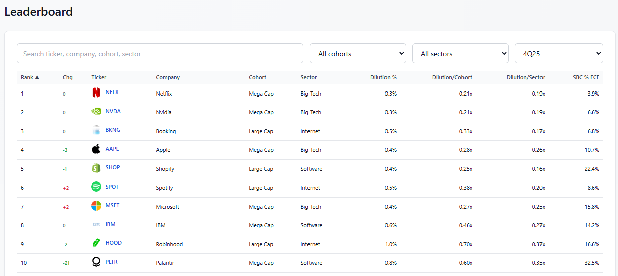
Netflix and Nvidia are tied at the top with 0.3% run-rate dilution. BKNG comes in at #3 with 0.5% (consistent with how I’ve always characterized them as the gold standard for SBC discipline in the internet cohort.) Apple, Shopify, and Spotify round out the top six. The leaderboard is filterable by cohort (Mega Cap, Large Cap, Mid Cap, Small Cap), sector, and quarter going back to 2018.
That last piece is important, the historical archive lets you go back and see how a company’s rank has changed over time. Palantir, for example, dropped 21 spots from last quarter to this one. Coinbase fell 16. Robinhood, on the other hand, has climbed to 9th (a remarkable improvement from the 10%+ dilution death spiral they were running in 2022).
Individual Company Pages
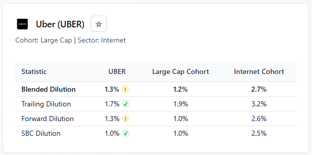
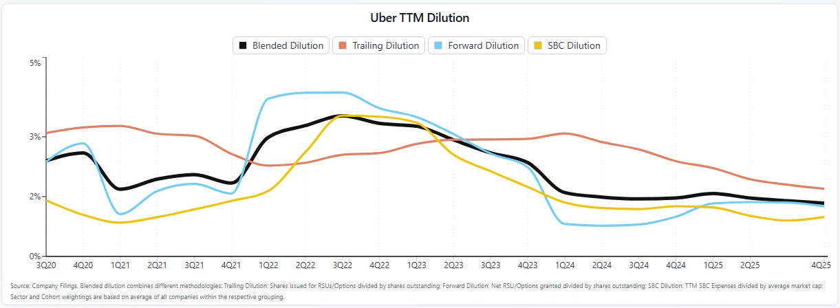
The Companies page lets you drill into any individual ticker. Each company page includes the core dilution metrics across the most recent quarters, cohort and sector comparisons, and the underlying methodology inputs. The goal is to make it auditable: you can see not just what the number is, but roughly how it was derived.
Custom Dilution Charts
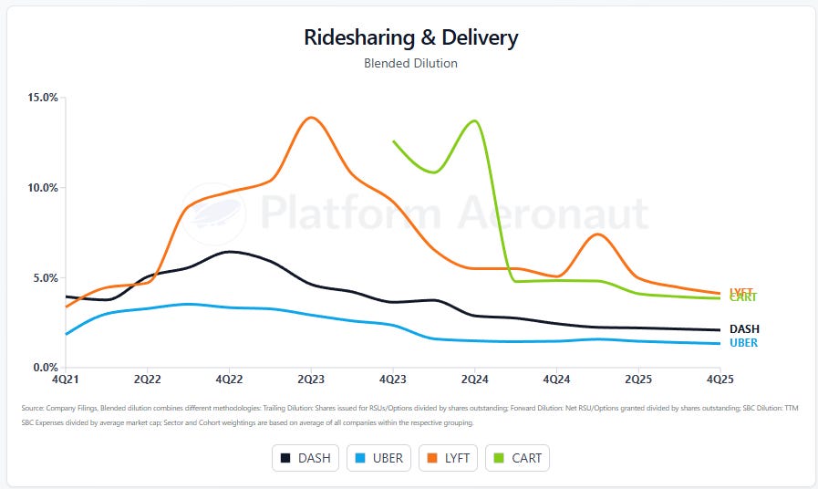
The Charts page has the ability for users to customize a dilution chart and compare companies any way that they wish. If you’re logged in you can save, edit, and share publicly if you choose. I’ll continue to refine this and add additional chart types and analysis in the future.
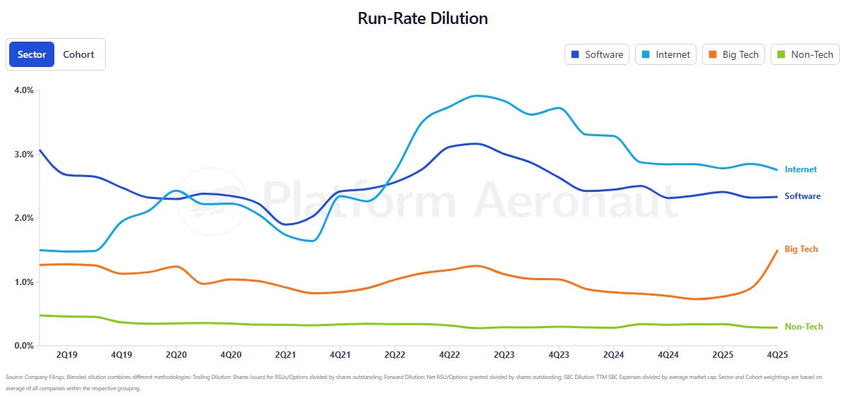
Dilution by Sector
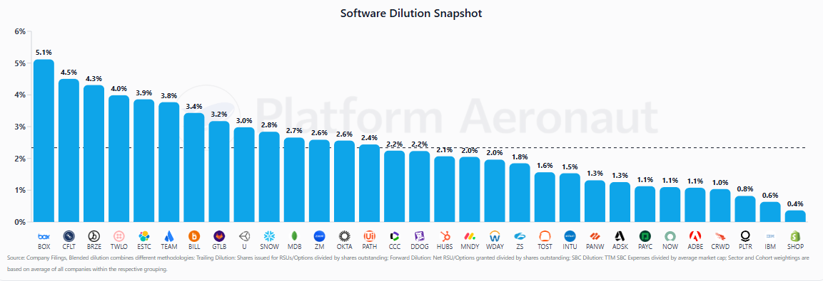
Finally, the Sectors page breaks the universe into Big Tech (10 companies), Internet (25 companies), Software (31 companies), and Non-Tech (14 companies). The non-tech cohort matters because it’s the benchmark. Best-in-class non-tech dilution runs at 10-30 basis points per year. KO 0.00%↑ at 0.1%. PEP 0.00%↑ at 0.1%. That’s the bar that tech companies should be aspiring to as they mature.
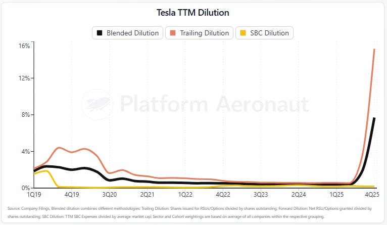
One Interesting Call-Out on Tesla
One thing worth calling out that’s impacting some of the sector and cohort level metrics is Tesla’s huge pay package to Elon. It’s single handedly boosted the mega cap and big tech metrics up based on it pushing TSLA 0.00%↑ dilution to almost 8%
A Note on Methodology
I’ve gotten pushback over the years on methodology (sometimes from management teams, sometimes from readers). The most common objection is about which share count to use: basic shares, diluted shares, or fully diluted. It’s a legitimate question and I’ve addressed it in prior posts. The honest answer is that getting to true FDSO for 100+ companies in a time-efficient way isn’t really possible, so there are tradeoffs.
The platform’s methodology uses a blended approach that averages forward and trailing dilution, with SBC as a % of FCF as a secondary metric. The forward dilution methodology (net RSU and option grants divided by shares outstanding) is what most management teams reference when they talk about “run-rate dilution.” It’s forward-looking and captures decisions being made today about grants, cancellations, and RIFs. The trailing methodology is what actually happened over the last twelve months. Averaging the two cuts through both the noise of timing and the optimism sometimes baked into forward framing.
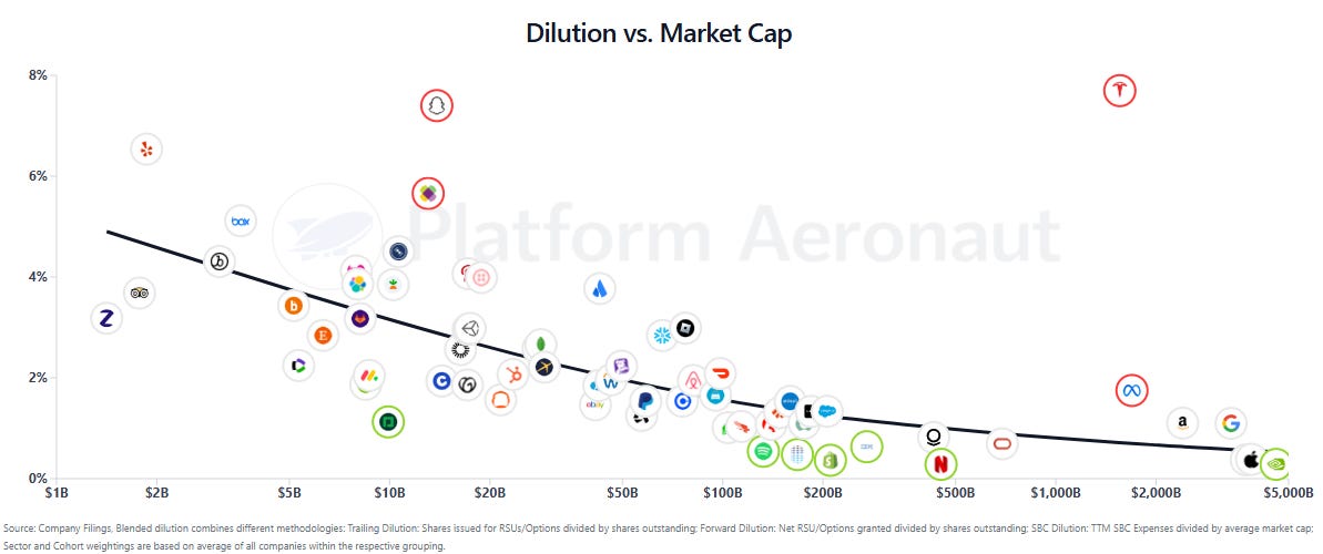
The cohort and sector relativization is equally important. Comparing Confluent to Apple on raw dilution doesn’t tell you much because they’re at different stages of maturity, different capital intensity profiles, different employee cost structures. The leaderboard ranks companies against their peer set so the context is relevant.
I’ve published a full methodology page that covers the core metrics, the ranking approach, and the important limitations, including the fact that this is a directional analytical tool, not investment advice.
The information presented in this newsletter is the opinion of the author and does not reflect the view of any other person or entity, including Altimeter Capital Management, LP (”Altimeter”). The information provided is believed to be from reliable sources but no liability is accepted for any inaccuracies. This is for informational purposes and should not be construed as investment advice or an investment recommendation. Past performance is no guarantee of future performance. Altimeter is an investment adviser registered with the U.S. Securities and Exchange Commission. Registration does not imply a certain level of skill or training. Altimeter and its clients trade in public securities and have made and/or may make investments in or investment decisions relating to the companies referenced herein. The views expressed herein are those of the author and not of Altimeter or its clients, which reserve the right to make investment decisions or engage in trading activity that would be (or could be construed as) consistent and/or inconsistent with the views expressed herein.
This post and the information presented are intended for informational purposes only. The views expressed herein are the author’s alone and do not constitute an offer to sell, or a recommendation to purchase, or a solicitation of an offer to buy, any security, nor a recommendation for any investment product or service. While certain information contained herein has been obtained from sources believed to be reliable, neither the author nor any of his employers or their affiliates have independently verified this information, and its accuracy and completeness cannot be guaranteed. Accordingly, no representation or warranty, express or implied, is made as to, and no reliance should be placed on, the fairness, accuracy, timeliness or completeness of this information. The author and all employers and their affiliated persons assume no liability for this information and no obligation to update the information or analysis contained herein in the future.
This is a welcome development, but looking at dilution in isolation misses the critical issue. Those that abuse SBC often mask dilution through over priced repurchases, and this causes more damage through destruction of shareholder capital than the dilution. Please watch this : https://rockandturner.substack.com/p/the-dangerous-game-investors-are?utm_source=share&utm_medium=android&r=1owuoe
Hey Thomas,
First of all, thx a bunch for putting this awesome tool together!
QQ. By looking at the Leaderboard, shouldn't companies be ranked in ascending order by Dilution % (aka Blended Dilution)? Lowest Dilution Rate first, highest Dilution Rate last...
I'm seeing Dilution % following an erratic pattern instead as I descend the Leaderboard. Maybe I am missing something, or you're using a different dimension to rank individual companies in the Leaderboard.
Cheers,
Fab